Case studyDemo siteOne-page siteFictional business, real build

A plumber's website, opened up.

Kestlebrook Plumbing & Heating does not exist. We built its website anyway, so you can see what a one-page project looks like, and why each part is where it is, before you buy one.

1 page1 formabout 176 KB to the first screen9 filesno plugins

The Kestlebrook demo on a phone: a cream page, a green Get a quote button and the headline The price before the work. The work done once.

The brief

We are four people and one phone. The worst calls come at night, from someone standing in water. We did not want a site that talks about quality. We wanted the number at the top, our real prices on the page, and a form Dana in the office can answer first thing. Nothing clever. Say what we say on the phone, and make it easy to call.
Kestlebrook, in the first call. The company is fictional; the brief is typical.
Client
Kestlebrook Plumbing & Heating, fictional
Sector
Residential plumbing and heating
Scope
Foundation, one page, $189 a month
Pages
1
Delivered
One page, one form, the words, and seven notes on why
Time to launch
One to two weeks

Kestlebrook does not exist. The brief is the one a real four-person shop gives us, and the build is the one they get.

Seven decisions

Seven things on the demo were decided, not defaulted. Here is each one, next to the screen it produced. On a computer the phone scrolls as you read.

The Kestlebrook demo, home page, part 1 of 2The Kestlebrook demo, home page, part 2 of 2

The phone number is a button in the header at every size

Open a typical trade website on a phone and the number is a line of text near the bottom, or hidden behind a three-line menu icon. A visitor has to find it, copy it, and switch to the dialler. Each step is a chance to give up, and the person giving up is standing in water.

On the Kestlebrook demo the number is a solid button in the top bar. Tap it and the phone dials. The bar is pinned, so it rides along with the scroll, and it never folds into a menu because there is no menu. The site is one page. Each section is one swipe down. On narrow screens the quote button steps aside so the call button keeps its size. On a wide screen the full number shows, since someone at a desk reads it and keys it into a phone.

For your business the question is the same. What is the one thing you want a hurried visitor to do? That belongs in the top bar, at every size, on every scroll.

See it in place

The first screen makes one promise and offers two moves

Most first screens open with a greeting, a stock photo of a handshake, and a line about quality service. None of that tells a visitor what happens after the call. It reads the same on every site.

Kestlebrook's first screen makes one claim in plain words: the price comes before the work. Under it sit two buttons, quote or call. The page has no third job. Then four facts, each with a check mark: a written price, a two-hour window, same day for leaks and no heat, and the licence number. Those facts carry the trust. On a phone the text comes first and the van photo second, and the layout holds if the photo is removed, so nobody waits on a picture to find the number. The first screen, van photo included, arrives in about 176 KB on a phone; the photos further down load only when you reach them.

We write this screen from your first call. One sentence you would stand behind, two actions, a few facts. It is the most useful thing on the page, so it goes first.

See it in place

Trust comes before the list of services

The usual order is hero, then a wall of services, then a why-choose-us block full of words like reliable and professional. Adjectives are free. Anyone can print them, so nobody believes them.

On the demo, Kestlebrook's three promises sit directly under the first screen, before a single service is listed. Price on paper first. Inside the window, with a heads-up on the way. The same licensed people every time, no subcontractors. Each promise is a card with a small icon and a paragraph in the words Dana uses on the phone, and each one contains something checkable: a fee that comes off the bill, a two-hour window, a licence number. A customer choosing a plumber is not comparing service lists. The choice is about who will turn up and not add surprises to the invoice, so that is what gets answered first.

Your promises will be different. We draft them with you, and anything you could not keep on a bad Tuesday does not go on the page.

See it in place

Help first, then the call

A site that wants the call usually just asks for it, in large red type. Someone with water coming through the ceiling does not need to be told it is an emergency. Help is more persuasive than urgency.

So this section opens with where the main shutoff is, and a photo of what one looks like. Step one stops the damage. Step two is the call, with the number as a full-width button, placed where a visitor is ready to press it. Step three is towels and buckets and staying away from the panel. Giving the advice away shows Kestlebrook knows houses, which is the real pitch. The section is tinted so a fast thumb catches it, and it is deliberately the calmest part of the page: nothing slides in, nothing but the call button reacts to a hover, just a soft rise for each piece as it scrolls into view, and even that is switched off for anyone whose phone asks for reduced motion.

Every trade has a version of step one. Yours goes here.

See it in place

Real numbers on the page, even rough ones

Plenty of trade sites say call for a quote and nothing else. The visitor cannot tell whether a drain clear costs a little or a lot, so the safe move is to try a site that says. Hiding prices hands the lead to whoever gave a rough number.

Kestlebrook's page has a short table of common jobs with from prices, a line explaining the visit fee and how it comes off the bill, and a boxed note about the after-hours charge. Where the price depends on the house, the table says so and promises a written quote on site instead of a guess. Beside the table, three lines explain how a visit unfolds, from first message to the word go. Two things follow. Visitors shopping for the cheapest possible job leave early, and everyone else calls with a rough idea of the bill already in mind. Every figure in the table is invented for this fictional company.

On your site the figures are yours. When a price moves, you send us the new one and a row changes.

See it in place

Reviews that answer the fears, clearly labelled

The standard move is a carousel of five-star quotes: great service, highly recommend, would use again. Visitors have learned to scroll past, and the suspicion that some were written in-house does not help.

The demo shows three reviews, each chosen because it answers a fear a customer has. Will anyone pick up on a Sunday night? Will the plumber try to sell me a furnace I do not need? Will the office call back when it said it would? Each has a name, a town and a concrete detail: a time, a part on the truck, a cupboard left clean. Each card carries an Example review tag, with a line above the grid saying the same thing, because Kestlebrook is a fictional company and inventing customers for it without saying so would undercut every other claim on the page.

On a real build we take reviews from your Google listing, with the wording you approve, and set them the same way. They do not refresh themselves. When a good one lands, you send it over and we add it.

See it in place

A form that takes 30 seconds and offers a way out

Most contact forms were built for a desk: a column of boxes, a message field expecting an essay, and a red border with no word about what went wrong. On a phone that is a chore, and chores get abandoned.

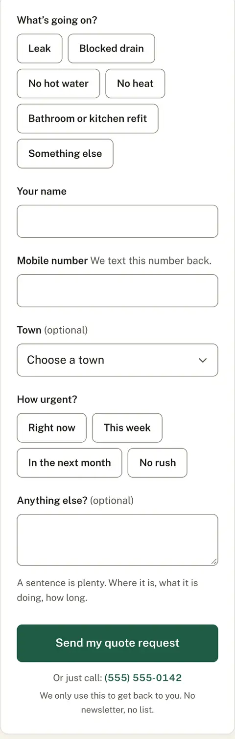
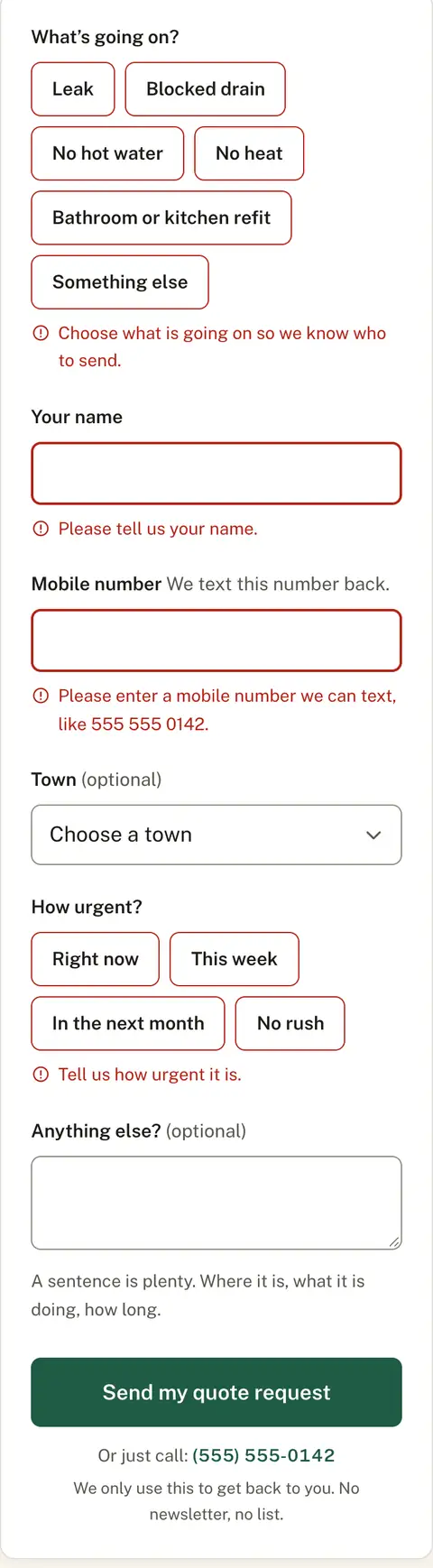
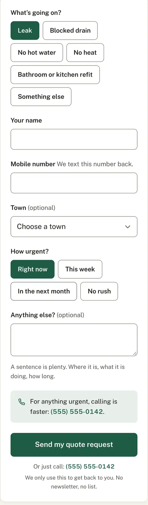
Kestlebrook's form has two boxes that take typing: a name, and a number the office can text. Everything else is a tap. What is wrong and how urgent are rows of big targets. Each box carries its label above it, and when a field is missed the form says what is missing, in a sentence, and moves the cursor there. Pick Right now and a note appears saying the phone is faster, because nobody should be typing while the ceiling drips. A field no person can see trips up the bots that fill in everything. The page's own script, form checks included, weighs 7 KB.

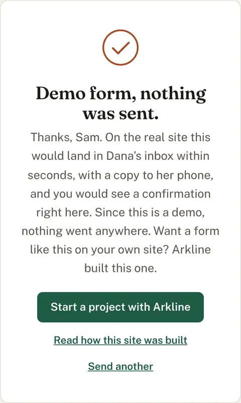
This demo sends nothing and says so on the success screen. Your version delivers to your inbox with every answer laid out, so you know what the job is before you call back.

See it in place

The form, tap by tap

A quote form is where most trade websites lose people. This one had to work with one thumb, on a phone, for someone standing in a wet kitchen. Here are the four states it shows and what each one is doing. Try them on the demo. Send it empty first.

1 of 4

Six chips for the six things people phone a plumber about. One tap picks the job and tells Dana who to send. Typing is kept to two boxes, a name and a mobile number. Town and notes are marked optional, and they are. Every chip and button is at least 44 pixels tall, so a thumb hits it first time.

2 of 4

Send it empty and the page does not just paint things red. Each missing field gets a sentence that says what to do: choose what is going on, give a name, enter a number they can text. The card gives a small shake, the first missing field takes the cursor, and a screen reader is told the same thing. Fix a field and its error clears as you type.

3 of 4

Pick Right now under How urgent and a line appears above the send button: for anything urgent, calling is faster, with the number ready to tap. A burst pipe needs a person on the line, not a request in a queue. The page says so at the moment it matters, instead of letting someone wait on a call back.

4 of 4

Press send and the button reads Sending for a moment. Then the fields fade, a copper tick draws itself, and the card says what it is: Demo form, nothing was sent. It uses your first name and says plainly that this is a demo and the request went nowhere. On your site this is where the request lands in your inbox, and the customer sees a plain confirmation in the same spot.

Nothing about it is clever. It asks four things, explains itself when something is missing, and gets out of the way. That is the whole job of a form. Try it yourself

From brief to launch

Our home page lists four phases: discover, design, build, launch. In practice a one-page project is eight steps. Here is what happens at each one, what you have at the end of it, and how much of your day it takes.

  1. Step 1The call

    About 30 minutes on the phone about the business, the customers, and what the site has to do. We ask what people say when they call, what they ask first, and what goes wrong. For Kestlebrook the answers were: they want the price before the work, and they are usually holding a phone.

    You get:
    A fixed quote in writing. It only changes if the scope does.
    Your time:
    About 30 minutes
  2. Step 2The brief

    We write down what we heard. Who the site is for, the one thing it has to say, the two things a visitor should be able to do, and what is in and out of scope. One page, plain words, no design yet. You read it and tell us what we got wrong.

    You get:
    A one-page brief we both agree on. Work starts when you say yes to it, with half the fee.
    Your time:
    Ten minutes to read it and reply
  3. Step 3First screens

    You get a link, not a PDF. The header and the first screen, working in a real browser on your own phone, with the first draft of the words already in place. Kestlebrook's first screen was a headline, two buttons, and four short proofs.

    You get:
    A private link you can open anywhere, and a short note on what to look at.
    Your time:
    Fifteen minutes on your phone
  4. Step 4Round one

    You tell us what is off. Wrong word, wrong order, that is not how we say it. We change it and the same link updates. One round is included, and a round is one set of notes sent together rather than a trickle across the week, so gather them and send them at once. You can react to real screens without watching a meter.

    You get:
    The same link, with your changes in it.
    Your time:
    About 20 minutes. We ask for your notes within a couple of days so the week keeps moving.
  5. Step 5Copy locked

    Every word on the page, read once more, out loud if it helps. Prices, hours, the towns you cover, the licence number, the phone number. This is where the wrong digit gets caught, because after this we build against it. Kestlebrook's prices are examples and the page says so. Yours would be real.

    You get:
    The final text in one document, with your facts in it.
    Your time:
    Fifteen minutes
  6. Step 6Build done

    We write the code we design, by hand. The page is built, the form checks its own fields, the images are sized for phones, and every section stays readable if a script never runs. You tap through it on your phone, then on a computer.

    You get:
    The finished page on a private link, ready to go live.
    Your time:
    Fifteen minutes tapping through
  7. Step 7Launch checklist

    Titles and descriptions for Google. The sitemap. The form pointed at your inbox and tested with a real send. The phone number tapped from a real phone. Weight and load time measured, not guessed. The Kestlebrook demo came in at about 176 KB on a phone and 189 KB on a computer, 9 files on a phone and 10 on a computer, loaded in 1.1 s, measured 15 September 2026.

    You get:
    A short checklist, ticked, and a request for three things: access to your domain, the inbox the form should reach, and the number the buttons should call.
    Your time:
    Ten minutes to send us three things
  8. Step 8Live and handed over

    We take it live on your domain, in accounts in your name, and submit the sitemap to Google so a search for your business name finds you. Then we send the logins, the files, the code, and a note on how to ask for a change. Nothing is held back. A window for fixes follows. After that, hosting, security and monthly edits simply carry on, because that is what the plan is.

    You get:
    The site, the code, the design files, the domain, the accounts. The plan simply carries on from here, with hosting, monitoring and your monthly changes.
    Your time:
    Ten minutes

Add it up and your side of a one-page project is about two hours, spread over one to two weeks.

Kestlebrook is fictional, so there was no client on the other end of these emails. This is the schedule a one-page project follows, not a diary of one.

The build, measured

Kestlebrook is a fictional company. The website is not. It is a finished one-page build, and these are its numbers, measured on 15 September 2026. Every one of them can be checked by anyone with the address.

176 / 189 KBFirst load, phone / computerEverything the browser downloads to show the page: code, type, photos, script. Read from the browser's network panel on a fresh load, once at phone width and once at desktop width.
7 KBScript, the page's ownThe page's own script, the one that runs the reveals and the form checks, weighed as the browser receives it. There is no framework underneath it. The Arkline notes panel you can open on the demo is our addition for this case study, a separate file, and would not be on your site.
9 / 10Files the browser asks for, phone / computerCounted in the browser's network panel on a fresh load, photos and fonts included. Fewer files means fewer round trips on a weak signal. One of them is our own visit counter on the demo, which would not be on your site.
1.1 sSeconds to the first screen on a phoneThe time from opening the link to the first screen being drawn, on a simulated phone connection. Same run as the numbers above, on 15 September 2026.
YesWorks with JavaScript offTurn it off in the browser and reload. Every section and the whole form are still there. The script only adds the reveals and the form checks, so taking it away removes nothing you need.
YesRespects reduced motionSet Reduce Motion on the phone and reload. Nothing slides or shakes. Sections are simply there, and the script drops its waits to zero. One block in the stylesheet, one check in the script.
All of themFields labelled, errors linkedEvery box has a visible label above it, in the code, not a hint that disappears when you type. While an error shows it is tied to its field, so a screen reader reads the two together, and the tie is dropped once the field is fixed.
44pxButtons, chips and menu linksThe minimum height set in the stylesheet for every button, choice chip and footer contact link. The boxes you type in are 48. Big enough for a thumb, and the minimum Apple's own guidelines ask for. Links that sit inside a sentence keep their text height.
ReadyTitle, description, canonicalThe name Google shows, the two lines under it, and the address Google should treat as the real one are all set in the page head. On the demo they say demo, and a line in the same place tells Google not to list it, because a fictional plumber should not turn up in search.
NoneNothing to update or installPlain files: the page, its stylesheet, its script, the fonts and the photos. No platform, no plugins, no logins to keep alive, nothing that breaks when a vendor changes its mind.

Measured on 15 September 2026 with our own test tools: an automated browser at phone and desktop widths (390 and 1440 pixels), the phone run on a simulated slow 4G connection, plus Google's Lighthouse test in its phone mode.

99
Performance
100
Accessibility
100
Best practices

Lighthouse gives the demo 99 for performance, 100 for accessibility and 100 for best practices, with the largest element painted at 2.0 s on a simulated phone. It scores the SEO category low on purpose: the demo tells Google not to list a fictional plumber. A real site would not.


Do not take our word for it. Open Google PageSpeed Insights, paste in the demo's address, and read the report. It is free and needs nothing but the address.Check it on PageSpeed Insights

What changes in five minutes

  • Prices in the table
  • Opening hours
  • The towns you cover
  • Reviews, swapped for real ones from your Google listing
  • Photos, swapped for your own
  • The phone number, everywhere it appears

Each of these is a line of text or a photo file in one place. On any plan, you send the change and we make it. Without a plan, you own the files and can hand them to anyone. Nothing on the page updates itself, and nothing needs to.

Open the demo

It was built for a phone. Scan to open it on yours.

Before and after

Most of our clients already own the before. So we built one: the same fictional business on a typical template. Drag the handle, or use the arrow keys.

The redesign on a phone
The template version on a phone
  1. Phone numberPlain text in the footer, about 3 screens down. Not tappable.A button at the top of every screen. One tap.
  2. Page weight910 KB on a phone176 KB on a phone
  3. Load on slow 4G4.8 s1.1 s
  4. Body text12 px, centred and grey16 px, left-aligned
  5. HeadlineThe company name and a welcomeOne promise: the price before the work

Both pages measured on 15 September 2026 on a phone over a simulated slow 4G connection. The before page is ours, built to show the difference; it is nobody's real site. Open the before page or the redesign.

What moves, and why

Here are six of the moves on the page. Each one is there to answer a question: where am I, did that work, what do I do next. They come with the exact values from the stylesheet, so you can see there is no trick to it.

The first screen loading in

Each line of the hero rises 12 pixels and fades in, one after the next, 60 milliseconds apart. The photo only fades. The page waits for the headline font before it starts, but never longer than 400 milliseconds.

so the page arrives placed, not dumped

html.js .enter { opacity: 0; transform: translateY(12px); transition: opacity 0.45s var(--ease), transform 0.45s var(--ease); transition-delay: calc(var(--i, 0) * 60ms); } html.js .enter.photo { transform: none; transition-duration: 0.5s; } html.js.is-ready .enter { opacity: 1; transform: none; } where --ease: cubic-bezier(0.2, 0.7, 0.2, 1); the 400ms cap is in main.js

Each section scrolling into view

When 15 percent of a section is on screen it rises 12 pixels and fades in, cards 80 milliseconds apart, and the short copper rule above its heading grows from nothing to 40 pixels. It happens once, then stays.

so each section announces itself once, then keeps still

html.js .reveal { opacity: 0; transform: translateY(12px); transition: opacity 0.45s var(--ease), transform 0.45s var(--ease); transition-delay: calc(var(--i, 0) * 80ms); } html.js .reveal.in { opacity: 1; transform: none; } html.js .rule.reveal { width: 0; transform: none; transition: width 0.4s var(--ease), opacity 0.3s; } html.js .rule.reveal.in { width: 40px; } the .in class is added by main.js at threshold: 0.15, once

The nav underline on a computer

A copper line grows from the left under the section you are reading, and under any link you point at or tab to. It takes under a fifth of a second.

so you always know where you are on a long page

.site-nav a::after { height: 2px; background: var(--copper); transform: scaleX(0); transform-origin: left; transition: transform 0.18s var(--ease); } .site-nav a:hover::after, .site-nav a:focus-visible::after, .site-nav a.is-current::after { transform: scaleX(1); }

The form nudge

Send the form with something missing and the whole card shifts 4 pixels left, then 4 right, then settles. A third of a second, no bounce.

a small no, so you look for the red text instead of tapping send again

.nudge { animation: nudge 0.3s var(--ease); } @keyframes nudge { 25% { transform: translateX(-4px); } 75% { transform: translateX(4px); } }

Sending, then the tick

Press send and a thin ring turns on the button while it says Sending. The fields fade out, the success card fades in, and after a short pause a copper tick draws itself in one stroke.

so you can see it took, before you read a word

.spinner { border: 2.5px solid rgba(255, 255, 255, 0.35); border-top-color: #fff; animation: spin 0.8s linear infinite; } @keyframes spin { to { transform: rotate(360deg); } } .form-fields { transition: opacity 0.2s; } .form-success { transition: opacity 0.25s; } .success-check .tick { stroke-dasharray: 40; stroke-dashoffset: 40; transition: stroke-dashoffset 0.4s var(--ease) 0.15s; } .form-success.is-in .tick { stroke-dashoffset: 0; }

The header shadow

Scroll more than 12 pixels and the header picks up a soft shadow, so it reads as sitting on top of the page. Scroll back to the top and it goes flat again.

so the phone number reads as pinned, not painted on

.site-header { transition: box-shadow 0.2s; } .site-header.is-scrolled { box-shadow: var(--shadow); } where --shadow: 0 2px 12px rgba(31, 28, 24, 0.08); the class is added by main.js when window.scrollY > 12

All of it: 17 transitions and keyframes in one stylesheet, 0 libraries.

Nothing here is decoration. If a move did not answer a question, we cut it. That is the difference between a page that feels alive and one that feels busy.

If your phone is set to reduce motion, the page listens. The last block in styles.css, @media (prefers-reduced-motion: reduce), turns off the slides, the rule draw and the nudge, and the script drops its delays to zero. Sections are simply there, and the form works exactly the same.

Yours next

The demo stops where a real project keeps going. Kestlebrook has no inbox, no phone, and no customers, so several things on that page are stand-ins. On your site they are real.

  • A form that sends. Every request lands in your inbox, and you see the test send before launch.
  • Your prices, your hours, your towns, and your licence number, in the words you use on the phone.
  • Your reviews, copied from your Google listing with the names your customers left. We add new ones when you send them. The page does not update itself.
  • Your photos, or a short list of the ones to take with your phone so the page does not need stock.
  • Your domain and your accounts, with the sitemap submitted at launch and Search Console set up in your name so you can watch it. A search for your business name finds you. Ranking for a competitive search takes time and is not part of the build.

One page, $189 a month

The same project, for your business

This is a Foundation site. One page at $189 a month, the words drafted for you, live in one to two weeks. The $189 paid on day one is month one, not a build fee. Hosting, backups, monitoring and a content edit a month are part of it. Extra pages are $19 a month each, and Growth carries up to eight. A fixed quote before we start, and it only changes if the scope does.

  • One page, fully custom, $189 a month
  • Extra pages $19 a month each
  • Copy drafted for you
  • Fast on every phone
  • You own the files and accounts
  • Live in 1 to 2 weeks