Case studyDemo site5-page siteFictional clinic, real build

A physio clinic's website, opened up.

Heronwater Physiotherapy does not exist. We built its website anyway: 5 pages and a booking flow, so you can see what a project this size looks like on a phone, and why each part is where it is, before you pay for one.

5 pages1 booking flowabout 130 KB to the first screen9 filesno plugins

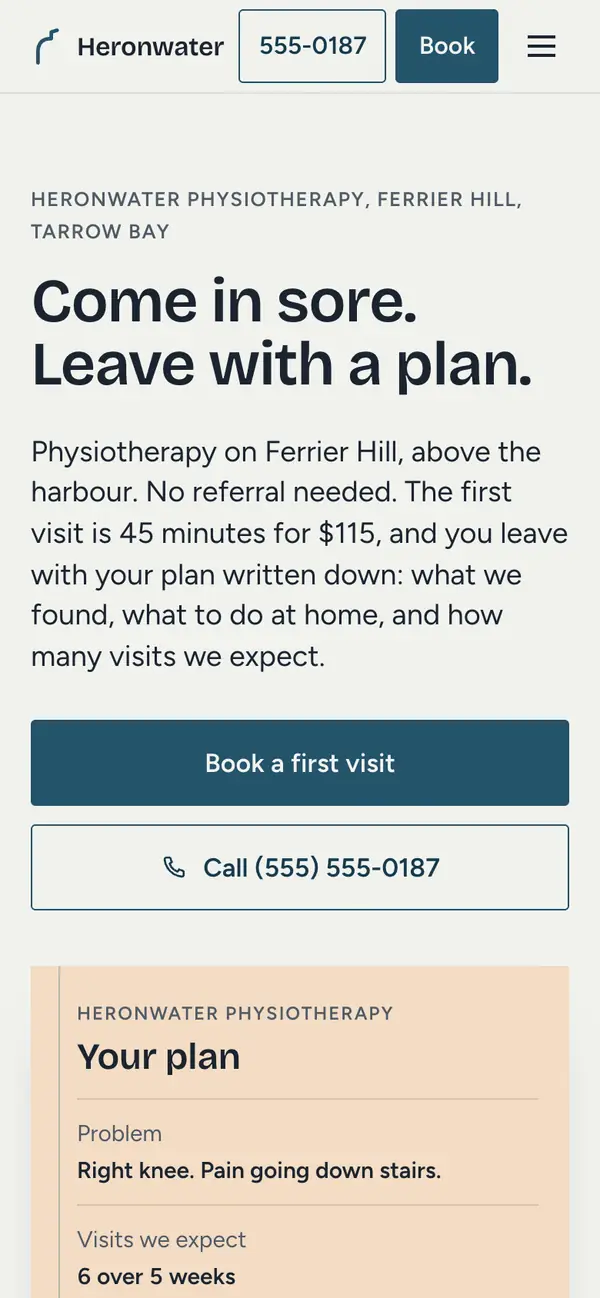
The Heronwater demo on a phone: a cool paper page, a heron blue Book a first visit button, the headline Come in sore. Leave with a plan. and, under it, a ruled plan card on a warm tint where a photo would usually be.

The brief

We are three physiotherapists and Jules on the desk. The people who never book are the ones we lose. They think they need a referral, they do not know what a visit costs, and they are not sure their plan will pay, so they wait. I want every price on the page, the insurance explained the way Jules explains it, and a way to book at ten at night on a phone without calling anyone. The thing we give people is a plan on paper. Show that. No stock photo of a spine, and no promises we would not make in the room.
Maya Lindqvist, clinic owner, in the first call. She, the clinic and the call are fictional. The brief is the kind a real three-physio clinic brings us.
Business
Heronwater Physiotherapy, Tarrow Bay, fictional
Scope
Growth, 5 pages
Pages
5: Home, Services, Team, Prices and insurance, Book
Timeline
One to four weeks
Price
$299 a month, up to eight pages, fixed in writing after the first call
Photos
Four stills of the rooms, nobody in them. A real build adds portraits.

Heronwater does not exist, and neither do Maya, Daniel, Hana or Jules. The prices, the hours, the timetable and the three reviews were written for the demo, and the pages say so. The brief is a real one, and the build is finished.

Seven decisions

Seven things across the demo's 5 pages were decided, not defaulted. Each one sits beside the screen it produced. On a computer the phone moves to that page and that section as you read; on your own phone, open the demo and find it.

The Heronwater demo, home page, part 1 of 2The Heronwater demo, home page, part 2 of 2
The Heronwater demo, book page, part 1 of 2The Heronwater demo, book page, part 2 of 2
The Heronwater demo, prices page, part 1 of 2The Heronwater demo, prices page, part 2 of 2
The Heronwater demo, services page, part 1 of 2The Heronwater demo, services page, part 2 of 2

One object, three jobs: the plan card stands where the photo goes

A person with a sore knee opens a clinic site to learn what the money buys, and most sites answer with a photo of someone on a treatment table. Heronwater answers with what you walk out holding. Where the hero photo would go, a written plan sits: the problem, the visits expected, the home work, a review on visit three, and who wrote it. A visitor reads a sample plan before reading a word about the clinic.

The card comes back twice more, as a stub at the foot of each service row with the typical visit count, and in the booking flow, filling in as choices are made. After three meetings a visitor could still picture it a week on, which is the work a brand does. A photo must be sourced and licensed; a card is set in type and changes in a minute. On your site the object is whatever you hand people at the end.

See it in place

The four questions that stop a booking, answered on the second screen

Someone who has never seen a physiotherapist is not weighing one service list against another. They are stuck on a handful of questions: is a referral needed, what does a visit cost, will the plan pay, is it open after work. Leave one open and the visitor closes the tab or puts the whole thing off another month.

The screen after the hero is a hairline strip of four facts: a referral is not needed in most provinces, a first visit runs 45 minutes and costs $115 with no tax, most plans are billed at the desk leaving $0 to $25 to pay, and it is open to 7 pm four nights a week. Each line can be tested with a single phone call, which is why it persuades where adjectives do not. For your clinic we find the four by asking what people phone the desk to check, and the same figures then appear on every page, so the site never argues with itself.

See it in place

Rows and bands, two sans faces, and only four large numbers

Someone comparing two clinic sites sees the same site twice: rounded cards with tinted icons, a serif headline, stock photos. Heronwater is built so it cannot be mistaken for that, or for our Kestlebrook demo. Services, prices and hours are ruled rows, the name on the left and minutes and dollars in a tabular column on the right. Sections alternate cool paper with full-bleed bands in one blue, a blue a heron earns. Two sans faces, both self-hosted, so the first screen is 130 KB on a phone.

Only four numerals on the site are set large: 10, 15, 15 and 5, the parts of a first visit. Every price and visit count sits small beside its label, so a reader meets what a number means before the number. The figures that calm someone get the weight; $115 never shouts. A theme gives every client the same look; a design gives each a set of choices that can be explained.

See it in place

A booking that can be finished without deciding anything

A nervous first-timer opens a booking page with no idea which visit, who, or which day, and a typical widget wants all three first. Many give up and mean to phone later. Heronwater's flow asks what, when and who in the order the desk uses, with two of them settled in advance. A row on step one reads Not sure and books a first visit and attaches a note, so nobody has to name their own injury. The default physiotherapist is whoever is free soonest, and on step two the earliest open time is preselected and labelled Soonest.

A person with no preference presses Next twice, types a name and a number, and the booking is done. The plan card fills in beside the steps and Back never loses an answer. Rows are real radio inputs, taken slots are announced as Taken, and a refresh loses nothing. On your site this front end drives the booking tool you already pay for, or that tool sits here instead.

See it in place

Every price on the page, the missed-visit fee included

Someone deciding whether to book has two money questions, cost and cover, and many clinic sites answer with a grid of insurer logos. Heronwater's page is a ruled table in tabular figures: every visit with its length next to its price, the lower follow-up rate for students and seniors, dry needling at no extra charge, and the $40 fee for a missed visit in the same table rather than on an invoice. Footnotes say no tax is added and the figures are invented for this demo.

Further down, direct billing is three steps at the desk: show your card, Jules sends the claim in while your coat goes on, you pay what remains, usually $0 to $25. Naming the range is what moves a hesitant person, because a fee they cannot predict is what stops them. A logo grid tells nobody what they will pay on the day. When a price changes on your site, one row changes and every page follows.

See it in place

The site says what it is not for

A patient unsure whether they belong here reads with one question in mind: will they take my money anyway? Most clinic sites never admit a limit. Heronwater's Services page carries a section on what physiotherapy cannot fix. Where a problem needs a scan, a doctor or another specialist first, the clinic says so at visit one, names who to see, and charges for that visit rather than a course. No open-ended plans, no maintenance packages nobody asked for.

The Book page goes further with the warning signs that belong in emergency tonight rather than with a physiotherapist on Thursday, ending with call 911 and attempting no diagnosis. Both sections cost a few bookings the clinic should never have taken and earn belief for everything else, prices and visit counts included. A family doctor picking a clinic to refer to remembers the one that knew its edges. Most businesses have a paragraph like this, and competitors rarely write it.

See it in place

A demo that admits it is one, on the screen and in the source

A visitor trying a demo booking flow wonders whether the last button sends anything. Heronwater says it is a demo before the first tap, here under the buttons, then under the time grid, above the final button, and on the end screen, whose page title changes so a screen reader hears it too. Nothing is sent and nothing is saved, and no plan numbers, health card numbers or dates of birth are asked for online.

The claim can be checked rather than trusted. The schedule script that works the demo times out from today's date ships on this page alone, so the other pages carry no booking code, and the script every page shares weighs 4 KB. Choices sit in sessionStorage inside a try and catch, so a refresh keeps the place and a locked-down browser breaks nothing. Without JavaScript the HTML holds the phone number and a plain form that says it sends nothing. On a real build a real send is tested before going live.

See it in place

The booking flow, tap by tap

A clinic's website earns its keep at the moment someone decides to book. On this one that moment is three screens and one short form, built to be finished with a thumb, at night, by a person who is sore and not sure what they need. These are its four screens in order, with a note on what each is for. Open the demo and pick Not sure, then press Next twice.

1 of 4

One question at the top: what do you need. Under it the visits sit in three short groups as ruled rows, minutes and dollars on the right, and First visit carries a tag saying where most people start. Not sure books a first visit with a note. Pelvic health and home visits show the number instead. Below, four chips: whoever is free soonest, or one of the three by name.

2 of 4

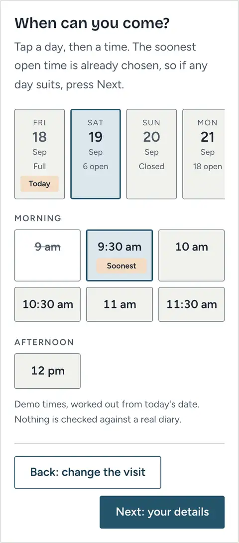
A strip of the next two weeks, each day showing how many starts are open, with Sunday reading Closed and a chosen physiotherapist's off days reading Not in. Times sit under Morning, Afternoon and Evening. The soonest open time is already selected and tagged, so a person with no preference presses Next. Taken slots stay visible but cannot be picked, and a line under the grid says these are demo times, worked out from today's date and checked against no real diary.

3 of 4

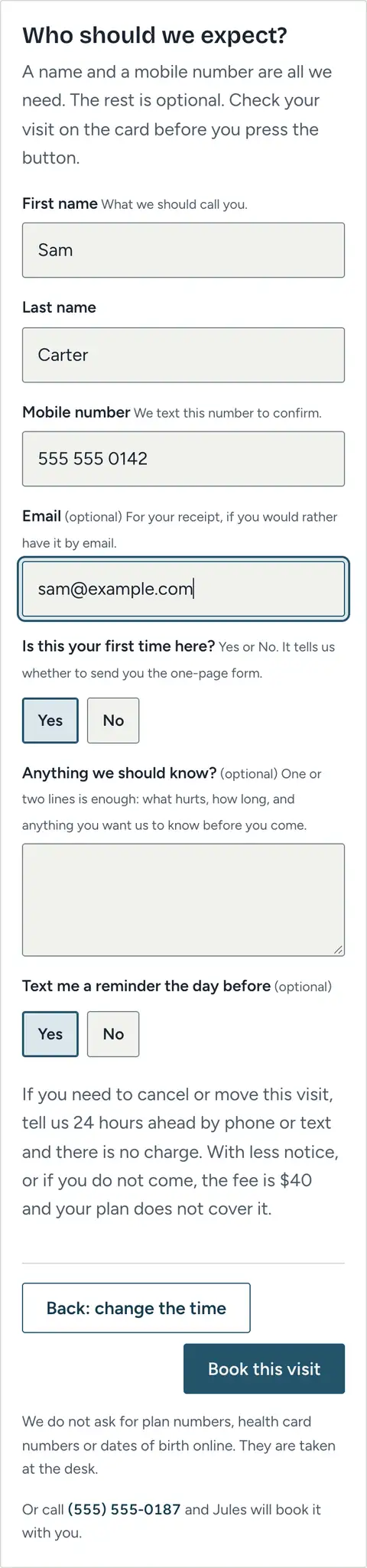
Who should we expect. Two names, a mobile number the desk will text, and an email only if you want the receipt sent. Yes or No for a first visit and for the reminder, a box for a line or two, nothing else. Labels sit above every field, and the plan card beside the form reads back the visit, the person, the day, the length and the price.

4 of 4

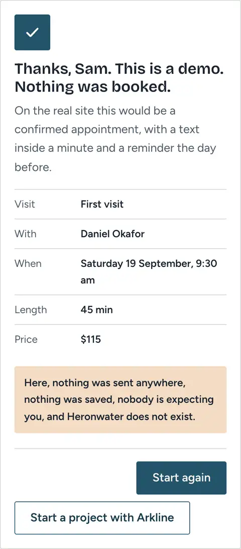
Press Book this visit and the button reads Booking for a moment. Then a white tick is drawn in a single stroke on a blue disc and the card says, using the first name you typed, that this is a demo and nothing was booked. Your choice is listed underneath the way the desk would say it back. One line makes it plain that nothing was sent or saved, nobody is expecting you, and Heronwater does not exist.

Three questions, asked in the order the desk asks them on the phone, and two of them answered before you arrive. The only typing is a name and a number. Try it yourself

From brief to launch

Our how-we-build page lists nine stops, eight of them before launch. Here is what those eight look like on a project the size of Heronwater: 5 pages, a booking flow, and a clinic owner who has a practice to run. For each stop, what happens, what you hold at the end of it, and how much of your time it takes.

  1. Step 1The call

    About 30 minutes with the person who will design and build the site. We ask how patients find you now, what they ask at the desk, and where they stall. For Heronwater the answers were referral, price and insurance, in that order, and most of the asking happens on a phone in the evening after the desk has closed.

    You get:
    A short proposal in plain words with one fixed price. For 5 pages and a booking flow, that is Growth at $299 a month, which carries up to eight pages.
    Your time:
    About 30 minutes
  2. Step 2The brief

    One page. Who the site is for, the one message it carries, what a visitor must be able to do, the pages, and what is out of scope. Heronwater's said: answer four questions before anyone books, show the plan instead of describing care, and let a nervous person book without deciding anything. You read it and argue with it.

    You get:
    The brief, agreed by both of us. Then we invoice, a start date is set, and design begins. The first month is invoiced here, and that payment is month one of the plan rather than a fee.
    Your time:
    Fifteen minutes to read it and reply
  3. Step 3The words

    We write before we design. Every heading, every price row, every button label and every error sentence on all 5 pages, drafted from the call. Where a fact is missing, a question sits in the text instead of a guess. For Heronwater that meant the price table, the hours, who is in on which day, and the plain sentences under the booking form about what is never asked online.

    You get:
    Every word on the site in one document, page by page, in the order a patient reads it.
    Your time:
    About 45 minutes. This is where you supply the facts: prices, hours, days in, registration numbers, and how names are spelled.
  4. Step 4The design link

    A private link, not a PDF. On a multi-page project it opens with the home page and one inner page, working in a browser on your own phone with the words already in them, so you can see how the design carries from one page to the next. For Heronwater the first thing on the link was the plan card standing where a photo usually goes, so the owner could decide early whether it was the right object to build the site around.

    You get:
    A link that keeps updating, and a short note on what to look at first.
    Your time:
    Twenty minutes on your phone
  5. Step 5Round one

    One set of notes, sent together. We work through them on the same link, and the words get tuned alongside the design because a heading reads differently once it sits on a screen. One round is included, which is why the notes come at once rather than in a trickle across the week. At the end of this round you sign off the design and the words, and we build to them.

    You get:
    The updated link, and a design and a set of words you are happy to build on.
    Your time:
    About 30 minutes, with your notes back within a couple of days
  6. Step 6The build

    We write the code ourselves. All 5 pages, the ruled tables with their tabular figures, the booking flow with its three steps and the plain form that replaces it when JavaScript is off, motion tuned by hand and switched off for anyone who has asked their phone for less of it, and a title and description for each page. The link fills in as pages land, so you can watch the site arrive.

    You get:
    The whole site on the same private link, every page, at every screen size, on plain files with nothing to update.
    Your time:
    Twenty minutes. This is the quiet stretch. You send the photos still missing, or take the ones on our shot list.
  7. Step 7Round two

    The same as round one, on the finished build. Every page on your phone, then on a bigger screen, and one set of notes. Check the small facts hard here: the number the call button dials, the price on every row, who is in on Saturday, the cancellation fee. The launch checks run against exactly what you sign off, so a wrong digit is far cheaper to find now.

    You get:
    The final site with your notes in it, and a written yes from you.
    Your time:
    About 45 minutes for 5 pages
  8. Step 8Live and handed over

    The checklist. Every link and button pressed once, a real send through the form, every page opened on a real phone, the domain in your name, the padlock, the sitemap submitted, Search Console on your own account. Weight measured, not guessed: the Heronwater home page came in at 130 KB on a phone and 130 KB on a computer, 9 files on a phone and 9 on a computer, the first screen drawn in 0.9 s on a simulated phone connection, measured 18 September 2026. Then it goes live and the handover follows: the files, every login, and a one-page manual.

    You get:
    The site live on your domain, the ticked checklist, and everything in your name. A tuning window follows, and after it a monthly plan if you want hosting and edits.
    Your time:
    Twenty minutes: access to your domain, the inbox for the form, the number the buttons should dial, and the word go

Add up the estimates and your side of a project this size is about four hours, spread over one to four weeks. Most of it is reading on your phone.

There was no clinic owner on the other end of these links, because Heronwater is invented. This is the route a project this size takes and the time each stop asks of you, not the record of one project.

The build, in numbers

Heronwater is invented. The 5 pages are not. They are a finished build, and these are its figures, taken on 18 September 2026. Anyone who opens the address in a browser can repeat them.

130 / 130 KBFirst load, phone and computerThe total the browser fetches to draw the home page: the page, its stylesheet, the two typefaces, its script and the favicon, plus the notes panel's stylesheet and script and the visit counter, which load on the demo and would not on your site. Taken from the network panel after a fresh load at a phone width, then again at a desktop width. The first screen carries the plan card rather than a photo, so no photo is in this total. The stills further down are fetched only when you scroll to them.
4 KBScript, the site's ownThe one script every page shares, sized as it comes over the wire. It adds the reveals, the header shadow, the phone menu and the current-page mark, and no page needs it to work. The booking page loads a second file, booking.js, on that page only: it holds the whole flow and the demo timetable, and it is not in this figure. The Arkline notes panel is a separate stylesheet and script of ours and would not ship with your site.
9 / 9Requests, phone and computerThe number of files the browser asks for on a fresh load of the home page, fonts included, read from the network panel. Three of them are ours rather than the clinic's: the stylesheet and script behind the notes panel, and a visit counter for the demo. Your site would carry none of the three.
0.9 sSeconds until the first screen, on a phoneHow long the first screen takes to appear after the link is opened, on a simulated slow 4G connection, in the same session as the figures above. The two typefaces are preloaded from the page head, so the headline arrives in its own face instead of swapping in later.
5PagesHome, Services, Team, Prices and insurance, and Book. Counted by opening the menu. Each has its own title and description for Google. Growth carries up to eight pages for the same monthly price, and a ninth would be $19 a month, so nothing else about the build changes.
11Transitions and keyframes, both stylesheetsCounted as the transition and keyframes declarations in styles.css and booking.css, leaving out the two reduced-motion blocks that switch them off. Every one is listed on the motion sheet below with its values. No animation library, no scroll library, nothing that keeps running on a timer after the page has settled.
48 pxButtons and fieldsThe height the stylesheets set for the main buttons and every box you type in, on the pages and inside the booking flow. Visit rows at step one are 56. The small buttons, such as Book this on each service row, the header links and the footer links, are 44, the floor Apple's guidelines ask for. A thumb lands first time.
0Cookies of its ownOpen the browser's storage panel after tapping through the booking. The site sets no cookie. The only entry is a single sessionStorage item holding your booking choices so a refresh keeps your place, and it is gone when the tab closes. The visit counter on the demo is ours, its maker states it uses no cookies, and your site would carry it only if you asked.
2Typefaces, self-hostedBricolage Grotesque in one weight for headings and the four large numerals, and Figtree for everything else. Two files, served from the same address as the pages, so no request goes to a font service and no visitor is reported to one. Counted in the network panel and in the two @font-face blocks at the top of styles.css.
1Booking flow, runs in the page, sends nothingRead booking.js: there is no request to any server in it. The timetable, the taken slots and the end screen are worked out in the browser from today's date. Turn JavaScript off and the same section shows the phone number and a plain form that says it sends nothing. On your site the same front end connects to your booking tool, or the tool is embedded in its place.

Measured on 18 September 2026 with our own test tools: an automated browser at phone and desktop widths (390 and 1440 pixels), the phone run on a simulated slow 4G connection, plus Google's Lighthouse test in its phone mode.

99
Performance
100
Accessibility
100
Best practices

Lighthouse gives the demo 99 for performance, 100 for accessibility and 100 for best practices, with the largest element painted at 1.8 s on a simulated phone. The SEO score is low on purpose. Every one of the 5 pages carries a line in its head asking Google to keep it out of search, because Heronwater is a fictional clinic and nobody looking for physiotherapy should land on it. A real site drops that line and is submitted to Google on launch day.

None of this needs our word. Open the demo, open the browser's developer tools, and read the network and storage panels yourself. Google's PageSpeed Insights runs the same load test for free from the address alone.Check it on PageSpeed Insights

Changed in five minutes

  • A price, on the table and on every row that repeats it
  • Opening hours, on the pages and in the booking timetable
  • Which days each physiotherapist is in
  • A physiotherapist's focus, languages, or a new name on the Team page
  • The three written examples, swapped for real reviews from your Google listing
  • The four stills, swapped for your own rooms, and portraits added

Each is a line of text, a photo file, or a value in the small block of data on the Book page that the booking flow reads. The first-visit price appears on all 5 pages, so a change touches 5 files, and it is still minutes. On any plan, you email the change and it is done. Without a plan, the files are yours to hand to anyone. Nothing here updates itself, and nothing has to.

Open the demo

Most people book from a phone in the evening. Scan to open the booking page on yours.

What moves, and what for

Six moves from the demo, with the values from the two stylesheets. A clinic site should feel steady, so most of these are small and short, and each exists to tell you something: where you are, what you picked, whether it took.

A section coming into view

When 12 percent of a block is on screen it rises 10 pixels and fades in over half a second. Items in a list follow each other 70 milliseconds apart. It happens once and the block stays put.

so each answer arrives when you reach it, then holds still

html.js .reveal { opacity: 0; transform: translateY(10px); transition: opacity 0.5s var(--ease), transform 0.5s var(--ease); transition-delay: calc(var(--i, 0) * 70ms); } html.js .reveal.in { opacity: 1; transform: none; } --ease is cubic-bezier(0.25, 0.6, 0.2, 1); main.js adds .in at threshold 0.12 with rootMargin 0px 0px -4% 0px, once per block

The header, once you scroll

Past 8 pixels of scroll the header turns from paper to white and picks up a soft shadow, over a quarter of a second. Return to the top and it lies flat on the page again.

so the Book and Call buttons read as pinned above the page, not painted on it

.site-header { transition: box-shadow 0.25s, background-color 0.25s; } .site-header.is-scrolled { background: var(--surface); box-shadow: 0 1px 0 var(--line), 0 8px 24px rgba(27, 36, 48, 0.06); } main.js toggles is-scrolled when window.scrollY > 8

A button on the blue band

On paper a solid button darkens on hover. On a blue or ink band the solid button is paper-coloured and brightens to white, and the outlined one takes a faint paper wash. A fifth of a second each way.

so a button answers the pointer without ever changing size

.btn { transition: background-color 0.2s, color 0.2s, border-color 0.2s; } .btn-solid:hover { background: var(--accent-dark); border-color: var(--accent-dark); } .band-blue .btn-solid, .band-ink .btn-solid { background: var(--bg); color: var(--accent-dark); border-color: var(--bg); } .band-blue .btn-solid:hover, .band-ink .btn-solid:hover { background: var(--surface); border-color: var(--surface); } .band-blue .btn-ghost:hover, .band-ink .btn-ghost:hover { border-color: var(--bg); background: rgba(241, 242, 238, 0.08); }

Choosing a visit, a day or a time

Tap a row and it takes the soft blue and a 3 pixel accent edge on the left, in a fifth of a second. Press and hold and it shrinks by one percent. Each time, the matching line on the plan card changes from grey to ink.

so you see the choice land in two places before you move on

.bk-choice { transition: border-color 0.2s, background-color 0.2s, box-shadow 0.2s, transform 0.15s; } .bk-choice:active { transform: scale(0.99); } .booking-shell .bk-services .bk-choice:has(.bk-radio:checked) { background: var(--accent-soft); box-shadow: inset 3px 0 0 var(--accent); } .bk-sum dd { transition: color 0.3s; }

Moving between steps

Press Next or Back and the new panel starts 10 pixels low and clear, then settles in over a third of a second, while the step number above fills with blue. Press Next with nothing chosen and the panel shifts 4 pixels left, then right, and a sentence says what to pick.

so a step change reads as one card replacing another, and a refusal is felt before it is read

.bk-panel { transition: opacity 0.35s var(--ease, ease), transform 0.35s var(--ease, ease); } .bk-panel.is-entering { opacity: 0; transform: translateY(10px); } .bk-step-n { transition: background-color 0.3s, color 0.3s, border-color 0.3s; } .bk-panels.nudge { animation: bkNudge 0.4s var(--ease, ease); } @keyframes bkNudge { 0%, 100% { transform: none; } 25% { transform: translateX(-4px); } 75% { transform: translateX(4px); } } booking.js holds is-entering for one frame and restarts nudge on each refused press

The tick

Press Book this visit and the button reads Booking for 800 milliseconds. Then the end screen replaces the steps and a tick is drawn in a single stroke, half a second long, starting a fifth of a second later.

so you know it took before you read that, in this demo, it did not

.bk-tick path { stroke-dasharray: 24; stroke-dashoffset: 24; animation: bkTick 0.5s var(--ease, ease) 0.2s forwards; } @keyframes bkTick { to { stroke-dashoffset: 0; } } the 800ms wait is a setTimeout in booking.js, 0 when reduced motion is on

The whole list: 11 transitions and keyframes across two stylesheets, and no library.

A physiotherapy clinic should feel like a steady hand, so nothing on these pages slides in from the side or floats. Each move is short, happens once, and tells you something. When it told you nothing, it was cut.

Set Reduce Motion on your phone and the demo listens. The last block of styles.css stops the reveals and the header and button transitions, the reduced-motion block of booking.css stops the panel slide, the nudge and the tick draw, and both scripts check the same setting: the reveals are shown at once, the Booking wait drops to zero, and the smooth scroll to the top of each step becomes a plain jump. The booking works exactly the same.

Yours next

Everything the demo could not do, a real project does. Heronwater has no booking tool behind its Book page, no inbox, no phone that rings, no patients and no faces. On your site each of those is real.

  • Booking that books. Your existing booking tool embedded on the Book page, or this front end connected to it where the tool allows. The account stays yours, and we make a real test booking before launch.
  • Your prices, your hours, your practitioners and the days they are in, your registration numbers, in the words the desk uses on the phone, with a title and description written for every page.
  • Portraits. Nobody in the demo has a face, because none of its stills show a person. A real build gets a short shot list, and we choose and place what you send back. The portraits are the most looked-at thing on a clinic site.
  • Your reviews. The three on the demo are written examples, invented and labelled as such. Yours are taken from your Google listing in wording you approve and set the same way. When a good one lands, you send it and we add it.
  • Your domain and your accounts, the sitemap submitted at launch and Search Console set up in your name. From launch day, a search for the clinic's name finds you. Ranking for physio near me takes months of separate work and is not part of the build.

5 pages, $299 a month

The same project, for your business

This is a Growth site. 5 pages at $299 a month, and Growth carries up to eight for the same price. The words are drafted for every page, with a booking flow and motion throughout. Live in one to four weeks. All 5 pages sit inside Growth's eight at no extra cost, and hosting and the monthly edits are included. A fixed quote after the first call, and it only changes if the scope does.

  • 5 pages, fully custom
  • $299 a month, up to eight pages
  • Copy drafted for every page
  • A booking flow, and motion throughout
  • You own the files and accounts
  • Live in 1 to 4 weeks